Orchid Society Branding
PROJECT TYPE: Brand Refresh
CLIENT: The South East Species Orchid Society
DATE: 2026
TOOLS USED: Illustrator, Photoshop and InDesign.
BRIEF:
Completed as part of an internship at the Liveworm Design Studio, this project was for the branding/logo design of the South-east Queensland Orchid Society. The client asked for the logo design to be inspired by the Australian Native Golden Swamp Orchid and to appear welcoming, timeless, and modern in style.
LOGO DESIGN:

OUTCOME:
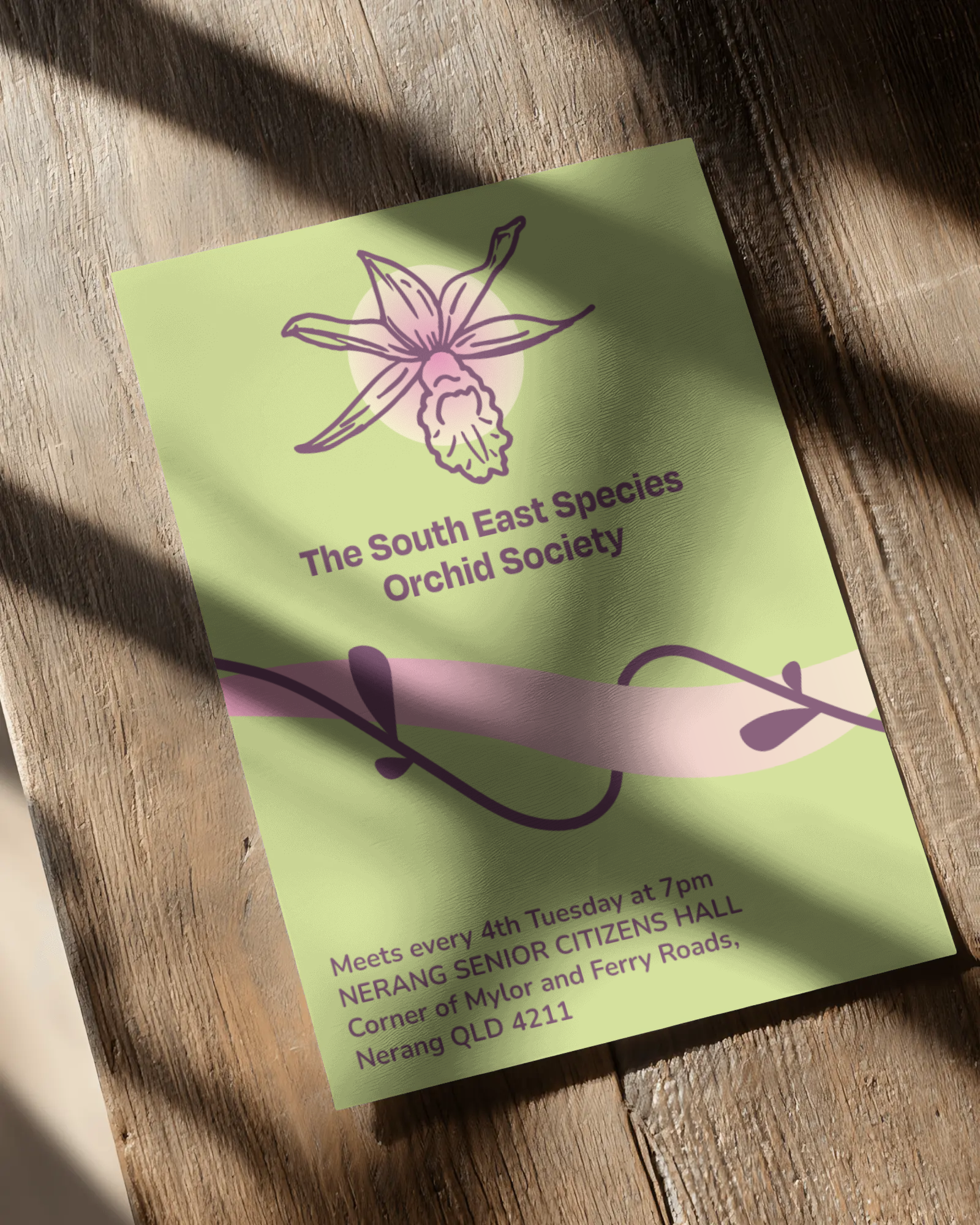
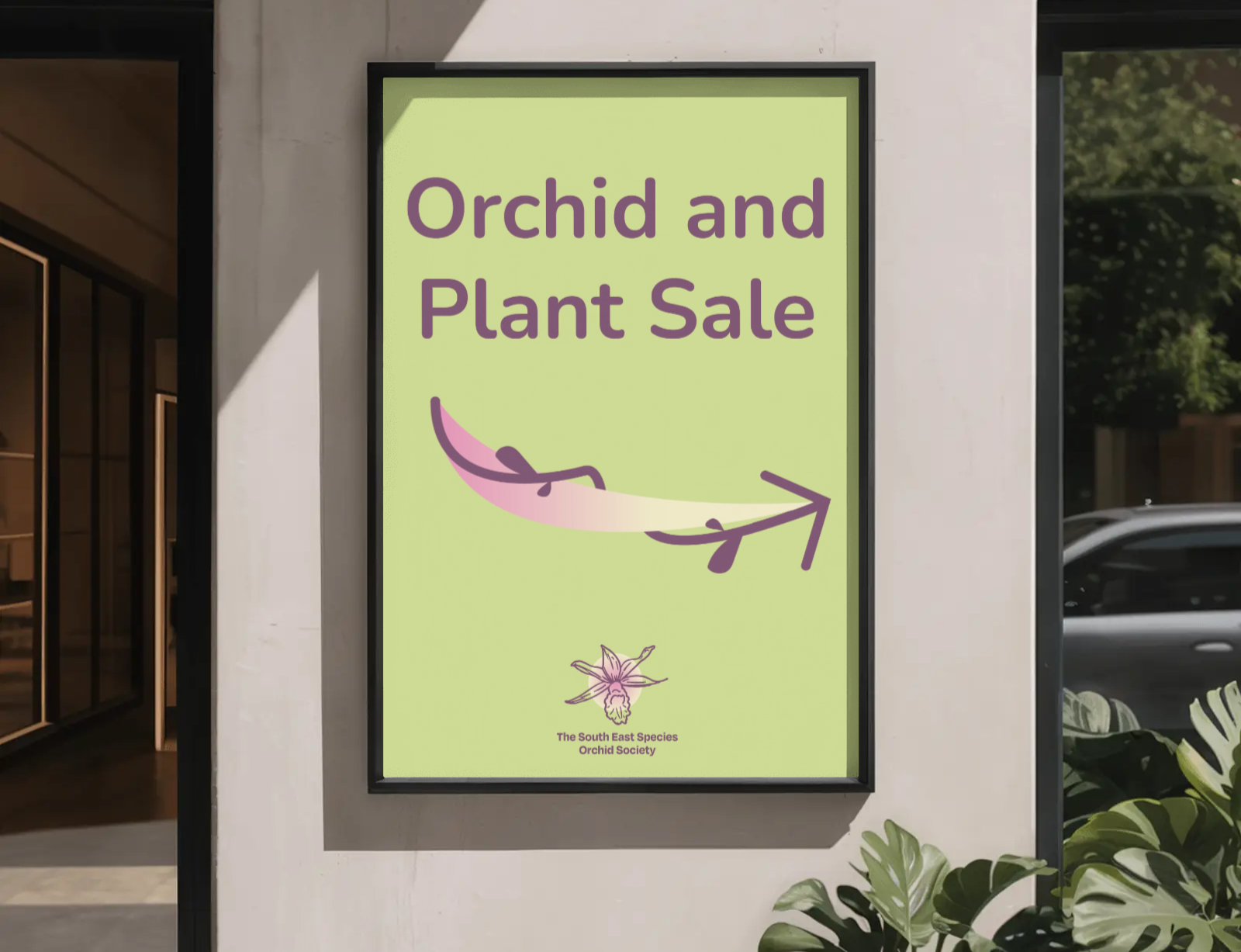
My concept for the club’s new branding was to simplify the Golden Swamp Orchid into line art that highlights the unique natural form of the flower. This line art style is simple and paired with the soft gradient in the background, appears soft, modern and welcoming.

COLOUR PALETTE:
The colour palette is inspired by the original greens of the Golden Swamp Orchid with purple and pink tones added in for contrast. The neutral cream tone can be paired with any of the other colours to create gradients. Together, these colours inspire thoughts of nature and vibrancy.
FLYER DESIGN MOCKUP: